

Whoa!
A different format?
You might have noticed that this page looks different from the others. Don’t worry, I haven’t lost my attention to detail, I’m just making incremental updates. Thanks for understanding.
Modernizing aircraft maintenance software for real-world operations
Summary
Project Description
Over several years, Boeing undertook a series of high-profile redesign initiatives to modernize how aircraft maintenance data is accessed. The largest of these efforts was Maintenance Performance Toolbox, the primary system used by airlines worldwide to access maintenance and engineering data for all aircraft models across web and mobile platforms. The core web application had not been substantially updated in more than 15 years. This three-year, $54M+ redesign program delivered a familiar but fundamentally improved experience, modernizing the platform while preserving the workflows maintenance teams rely on every day.
My Role
As Lead UX Designer, I was responsible for the end-to-end user experience across web and mobile. I led a team of UX designers and partnered closely with a dedicated UI development team to deliver the redesigned system. I also founded and chaired the Customer Advisory Board, bringing together maintenance leaders from 17 airlines to directly inform research, design decisions, and validation throughout the program.
Users & Environment
Toolbox serves a broad range of airline personnel involved in maintenance and engineering, as well as others who rely on accurate, up-to-date aircraft maintenance data. Users operate in demanding environments that range from office settings to hangars, aircraft interiors, and active airport flight lines, often under time pressure and safety-focused conditions.
Toolbox Before & After
The images below show the exact same Maintenance Performance Toolbox screen before and after the redesign. The comparison highlights how the interface was modernized while preserving the structure and workflows maintenance teams rely on. Click on each to see them larger.
Before: Maintenance Performance Toolbox
After: Toolbox "Horizon" (code name)
Research
Note: For much more detail on my research and design process, check out: Select an Airplane Case Study
Onboarding Mockups
Description
This workflow introduced onboarding to Maintenance Performance Toolbox for the first time. Following a major redesign, onboarding was critical to supporting adoption and reducing friction for both new and returning users. It also created an opportunity to validate user profile and contact information that, in many cases, had not been updated since accounts were originally created.
Problem
Before the redesign, user setup and change communication relied heavily on in-person training during airline implementations. While release notes were produced, they were sent to individual contacts and rarely reached day-to-day end users, leaving many unaware of new features or changes to the system.
Solution
On first launch of the redesigned application, users are guided through a lightweight onboarding flow to confirm their information and orient themselves to the new experience. The What’s New feature serves a dual purpose: introducing key changes to transitioning users and providing ongoing release awareness for future updates, ensuring communication reaches users directly within the product.


Use the Left and Right arrow controls to view additional mockups.
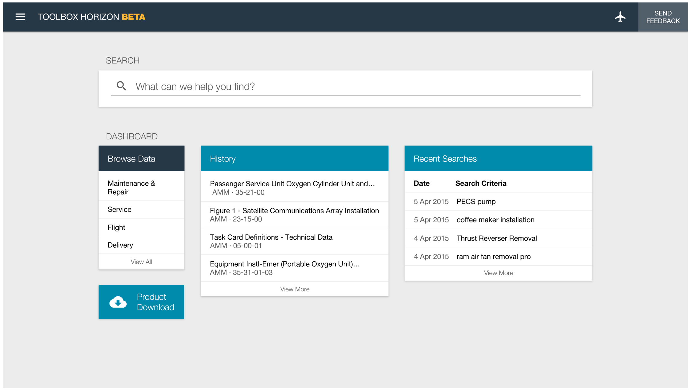
Landing Page Mockups
Description
The landing page combines global search with a flexible dashboard. Across all user personas, research consistently showed that the primary need was faster, easier access to relevant maintenance data.
Problem
Before the redesign, Maintenance Performance Toolbox was rigid and difficult to personalize. Search was buried and unintuitive, and nearly a third of the screen was consumed by outdated tabs and product overhead, slowing users down before they even reached their data.
Solution
The redesigned landing page provides a clean, customizable starting point. Users can quickly access information through a prominent, Google-style search or jump directly into browsing their data. Legacy product overhead was consolidated into a streamlined navigation menu, freeing up space and reducing cognitive load.

Use the Left and Right arrow controls to view additional mockups.
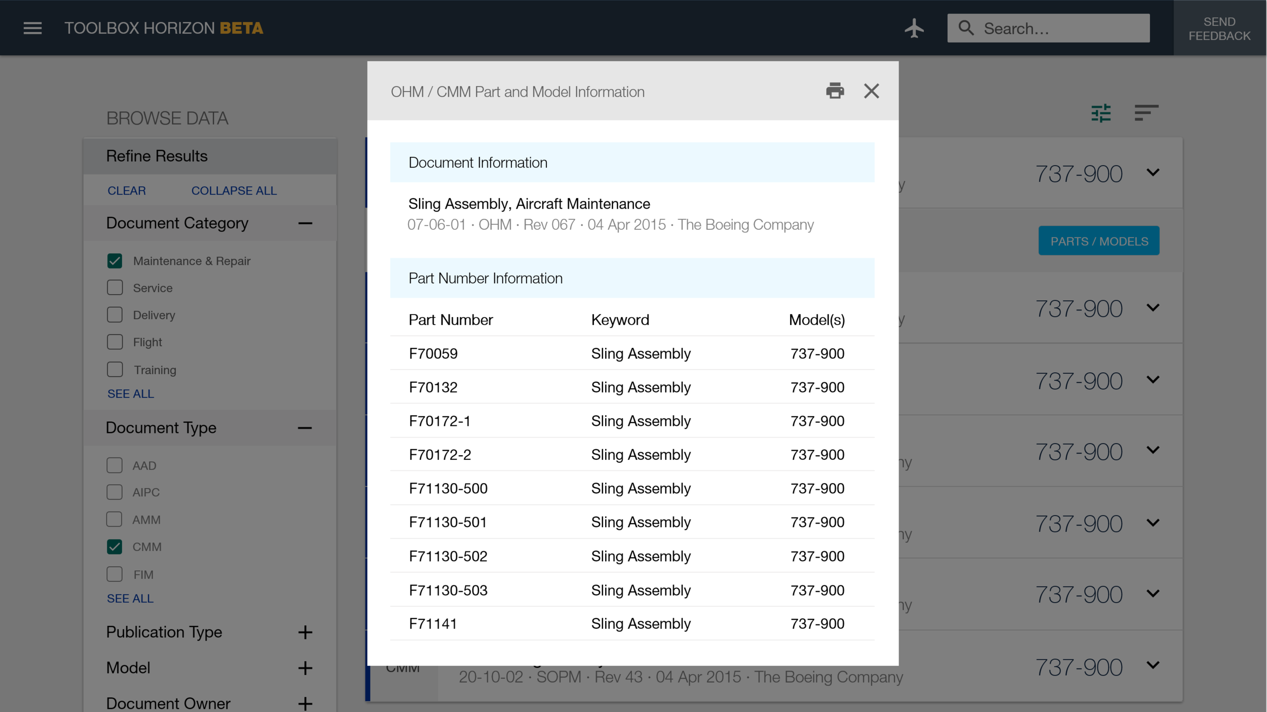
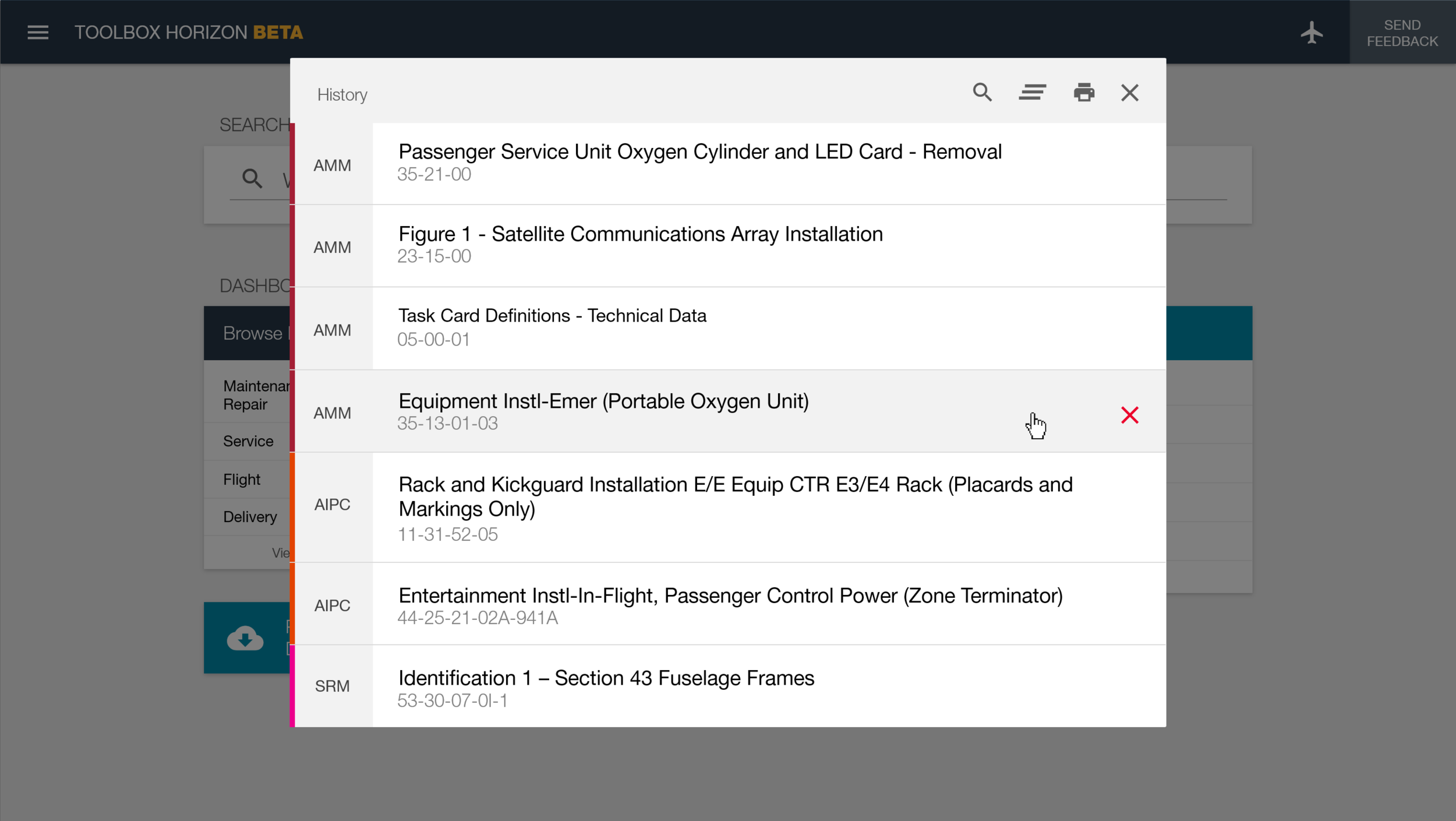
Search Mockups
Description
Research and usage analytics showed that accessing maintenance data was split almost evenly between browsing and searching. Because search played such a critical role in daily workflows, redesigning it became a major focus of the project.
Problem
Prior to the redesign, Maintenance Performance Toolbox relied on multiple, disconnected search tools for different data types, often hidden in different areas of the application. Even when users found the correct search, the underlying search technology was outdated and produced inconsistent results. As a result, many users avoided search altogether and relied on manual browsing instead, slowing down critical tasks.
Solution
Through on-site workshops and customer advisory sessions, it became clear that search adoption would increase if results were more accurate, transparent, and easier to refine. The redesigned experience introduces a single, unified search across all data types, with recommended results, recent searches, and quick access to relevant facets. Faceted filtering allows users to quickly narrow complex maintenance data, making search faster, more reliable, and better aligned with how users think about their work.


Use the Left and Right arrow controls to view additional mockups.
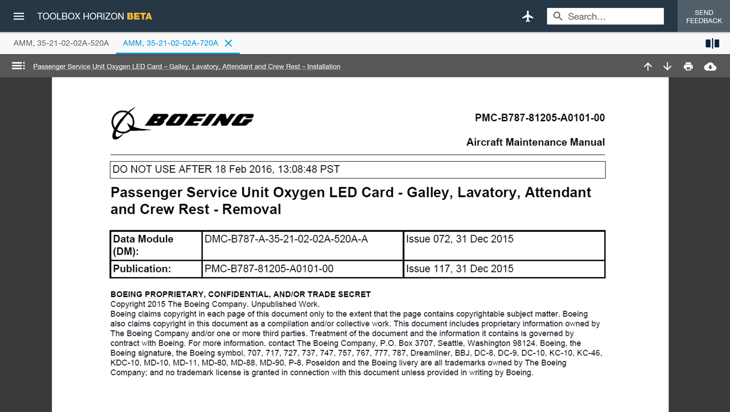
Browse Data Mockups
Description
A core goal of the redesign was to increase consistency across common workflows while reducing the number of steps required to access maintenance data. Browsing, in particular, needed to feel intentional and efficient rather than secondary to search.
Problem
Although both browsing and search ultimately led users to the same destination - viewing maintenance data - the experiences were fragmented and inconsistent. Differences in layout, interaction patterns, and filtering created unnecessary friction and increased cognitive load.
Solution
The redesigned browse experience adopts the same interaction patterns and visual structure as search results. By aligning these workflows, users gain a consistent mental model for finding data, whether they arrive through browsing or search. Usability testing confirmed that this consistency made the system easier to learn, faster to use, and more predictable in daily work.

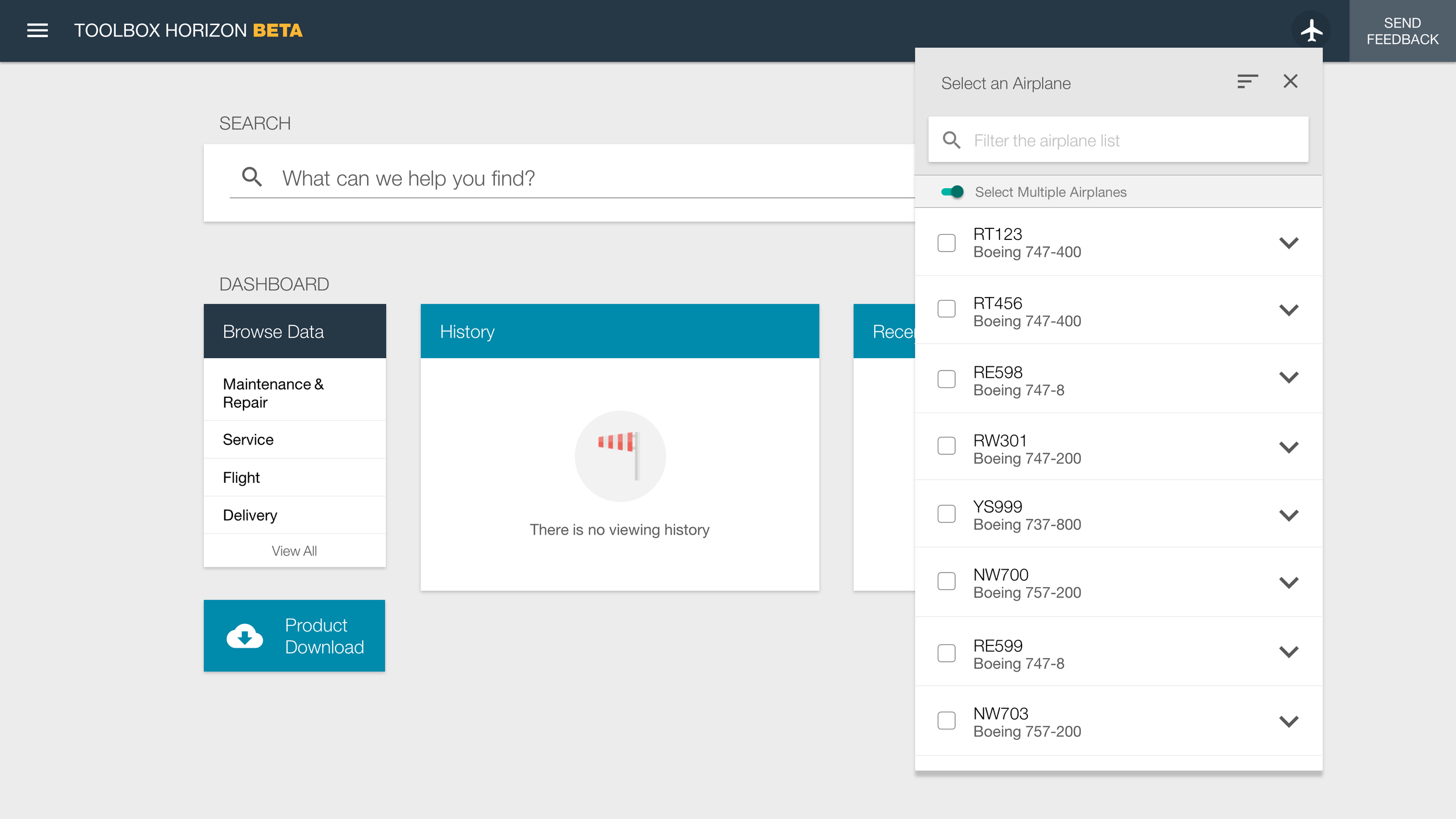
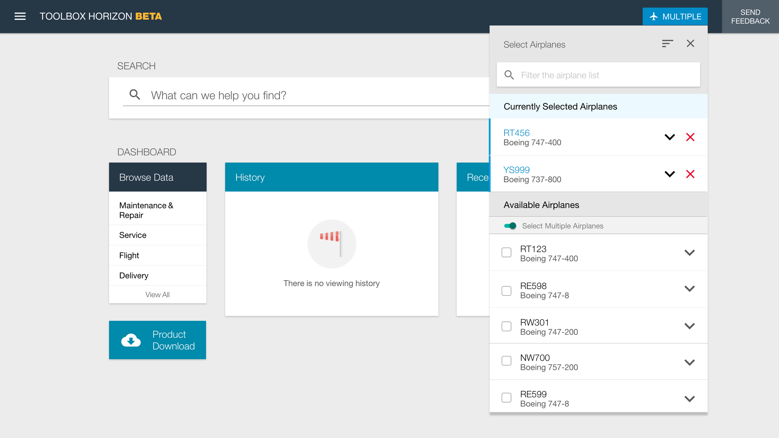
Select an Airplane Mockups
Description
Maintenance Performance Toolbox scopes technical and maintenance data to a specific aircraft. Selecting an airplane sets the application context and ensures that only relevant data is displayed throughout the system.
Problem
Before the redesign, the Select an Airplane interaction behaved inconsistently across tabs, even though the UI implied a global context. The interaction appeared unpredictably, required different steps depending on location, and frequently confused users. More critically, this inconsistency created real risk. Users could unknowingly view incorrect technical data for maintenance tasks, undermining trust in the system and introducing safety concerns.
Solution
The redesigned interaction establishes a clear, global application context through a consistent airplane selector in the header. Users can quickly search, sort, and filter the aircraft list, and select multiple airplanes when needed. This approach made context-setting explicit, predictable, and safe across the entire application. For more details on the process of researching and designing this, check out: Select an Airplane Case Study.


Use the Left and Right arrow controls to view additional mockups.
Toolbox Remote Mockup
Description
Toolbox Remote is an offline, self-contained version of Maintenance Performance Toolbox designed for use in environments without reliable connectivity. It runs across laptops, aircraft-installed computers, tablets, and phones, and was the first product in the Toolbox suite to undergo the redesign. The experience needed to remain familiar to users while functioning entirely offline.
Problem
Toolbox Remote had to work across a wide range of devices and operating environments, from airline maintenance laptops to proprietary onboard systems, cockpit tablets, and phones. Native Windows, iOS, and Android. The design needed to fully leverage responsive web patterns while accounting for offline constraints. Late in the project, I was also asked to support a Windows 10 tablet pilot, which required additional native application designs. Technical limitations of local HTML5 and JSON storage further constrained the search experience compared to the online version.
Solution
The final design aligned Toolbox Remote closely with the online experience, preserving familiarity while adapting interactions for offline use. Although search functionality was more limited, usability testing revealed that in some scenarios users preferred a dedicated, local search over a global one. The application was well received and deployed globally, including use in live airline operations. I was able to observe it in use aboard a Virgin Atlantic 787 cockpit, validating the design in a real operational environment.
Native Windows 10 tablet design mockup.
Toolbox Remote on a Virgin Atlantic 787 cockpit tablet.
Responsive Web Design
The Maintenance Performance Toolbox redesign – online and Remote – was a completely responsive experience. Nearly all features support breakpoints from XL screens, to phone-sized screens. This was a first for a major Boeing project.
Other Mockups
The redesign of Maintenance Performance Toolbox was an extensive, enterprise-level undertaking. It wouldn't be possible to show everything in a portfolio. Below are some additional selected designs from this project.


Use the Left and Right arrow controls to view additional mockups.