

Toolbox
Selecting an Airplane
350
Aviation Customers
46k+
Active Users
$28B
Portfolio Revenue
Overview
This case study walks through my end-to-end design process, from research and problem framing through iteration, validation, and final mockups, as part of a $54M, multi-year redesign of Boeing’s Maintenance Performance Toolbox (Toolbox). Much of this work took place during an on-site Customer Advisory Board workshop attended by representatives from all 19 airlines.
The focus was addressing a critical interaction flaw with potential safety implications. A feature that initially received 0% positive feedback was redesigned through this process and ultimately achieved 79% positive approval, improving usability, restoring trust, and supporting safer decision-making in a critical maintenance tool.
CONTEXT
Toolbox allows maintenance staff to view technical and performance data for individual aircraft and, in many cases, serves as the primary interface for accessing fleet maintenance information. To ensure accuracy, users must first select a specific airplane, which scopes the data shown across the application and hides information that does not apply.
This case study focuses on improving the negatively reviewed airplane selection experience based on years of direct user feedback and observation gathered through the Customer Advisory Board.
Problem
Prior to the redesign, the Select an Airplane interaction behaved inconsistently across Toolbox’s multiple features and data types. The interface implied that airplane selection applied globally, but it did not. The interaction required different steps depending on where the user was within Toolbox, appeared inconsistently, and was difficult for users to understand in general.
More importantly, this inconsistency introduced real operational risk. Because the selected airplane was not reliably reflected across the application, users could unknowingly view incorrect technical data when performing maintenance on an airplane. This undermined trust in the system and had the potential to impact safety.
MY ROLE
Led end-to-end UX design across a large-scale, multi-year enterprise platform redesign spanning web and mobile experiences.
Founded and chaired the Customer Advisory Board, embedding continuous user research into product strategy and design decisions.
Partnered closely with product , engineering, and aviation experts to align design direction with real-world maintenance workflows and safety constraints.
Defined interaction models for search, browsing data, aircraft context, onboarding, and data visualization across complex maintenance datasets.
Drove usability improvements in critical, data-dense environments by prioritizing clarity, consistency, and reduced cognitive load.
Established and scaled shared UX patterns and components to improve cross-product consistency across the Toolbox platform.
“Aryk has a rare ability to look at an application or system and immediately understand what it should be. I’ve seen him both elevate existing products and build new ones from the ground up, guiding them into form with confidence, speed, and excellent judgment.”
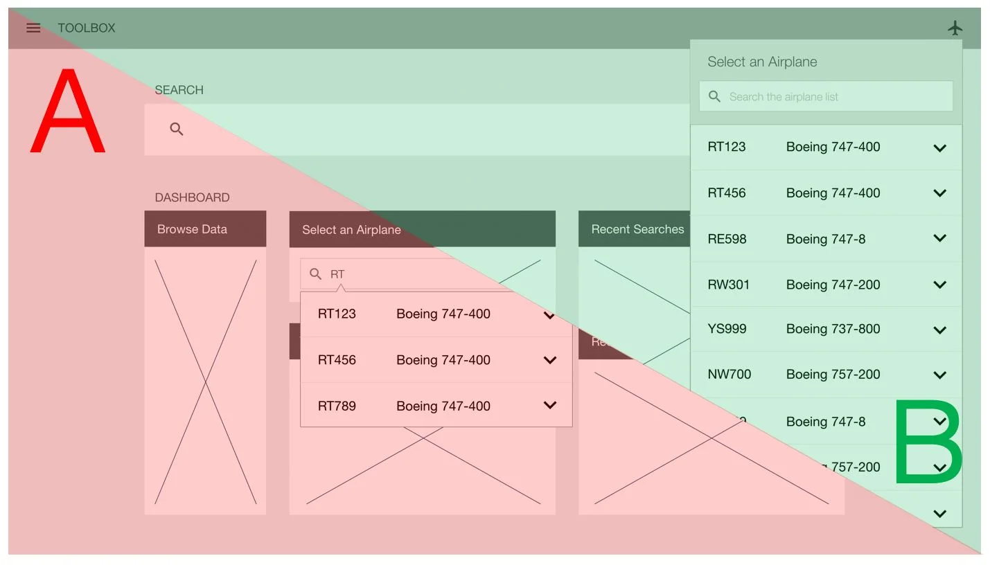
Before & After
The images below show the Select an Airplane function before and after the redesign. This comparison highlights how the interface was modernized while addressing the core problem. Airplanes are selected in one location, and clearly indicated globally. Click on each to see them larger.
Research
This problem was already well known prior to the workshop, having surfaced repeatedly through customer feedback and product enhancement requests. The on-site workshop provided an opportunity to validate and prioritize the issue with users, where a feature usage survey identified it as one of the lowest-rated feature.
The research approach focused on building shared understanding and uncovering root causes. We examined the issue through live walkthroughs of the existing product, facilitated discussion, scenario-based user observation, and structured likes and dislikes exercises. This allowed us to move beyond anecdotal feedback and clearly identify where and why the experience was breaking down.
Survey with 73% disapproval (red) for Select an Airplane
Airline attendees participating in a Likes/Dislikes exercise
Design
Following the Select an Airplane research session, I sketched multiple solution concepts that fit within the existing design paradigm. The goal was to have tangible concepts to review with customers the following day, validating direction early while the context was still fresh. Through this exploration, two primary interaction flows emerged: one using a dedicated widget on the dashboard, and another accessed through an icon in the global header.
After reviewing the sketches with workshop attendees and incorporating their feedback, I translated both approaches into low-fidelity wireframes that evening. This allowed us to compare the two flows side by side during the workshop, validate assumptions with real users, and confirm which direction best supported clarity and consistency before moving into higher-fidelity design.
A sketch of a Dashboard widget workflow
A sketch of a header bar workflow
A wireframe from the Dasbhoard widget workflow
A wireframe from the header bar workflow
Validation
The following day, I walked through both concepts with workshop participants using the low-fidelity wireframes. Airline attendees discussed what worked, what didn’t, and why, with feedback captured in real time through our established workshop process.
We then conducted a structured comparison of the two concepts, effectively running an A/B evaluation with the group. Of the 19 airlines represented, 18 preferred the same design direction, giving us a clear signal on which approach best supported clarity, consistency, and usability before moving forward.
Me talking with a workshop attendee
A/B Testing different design directions
Iterate
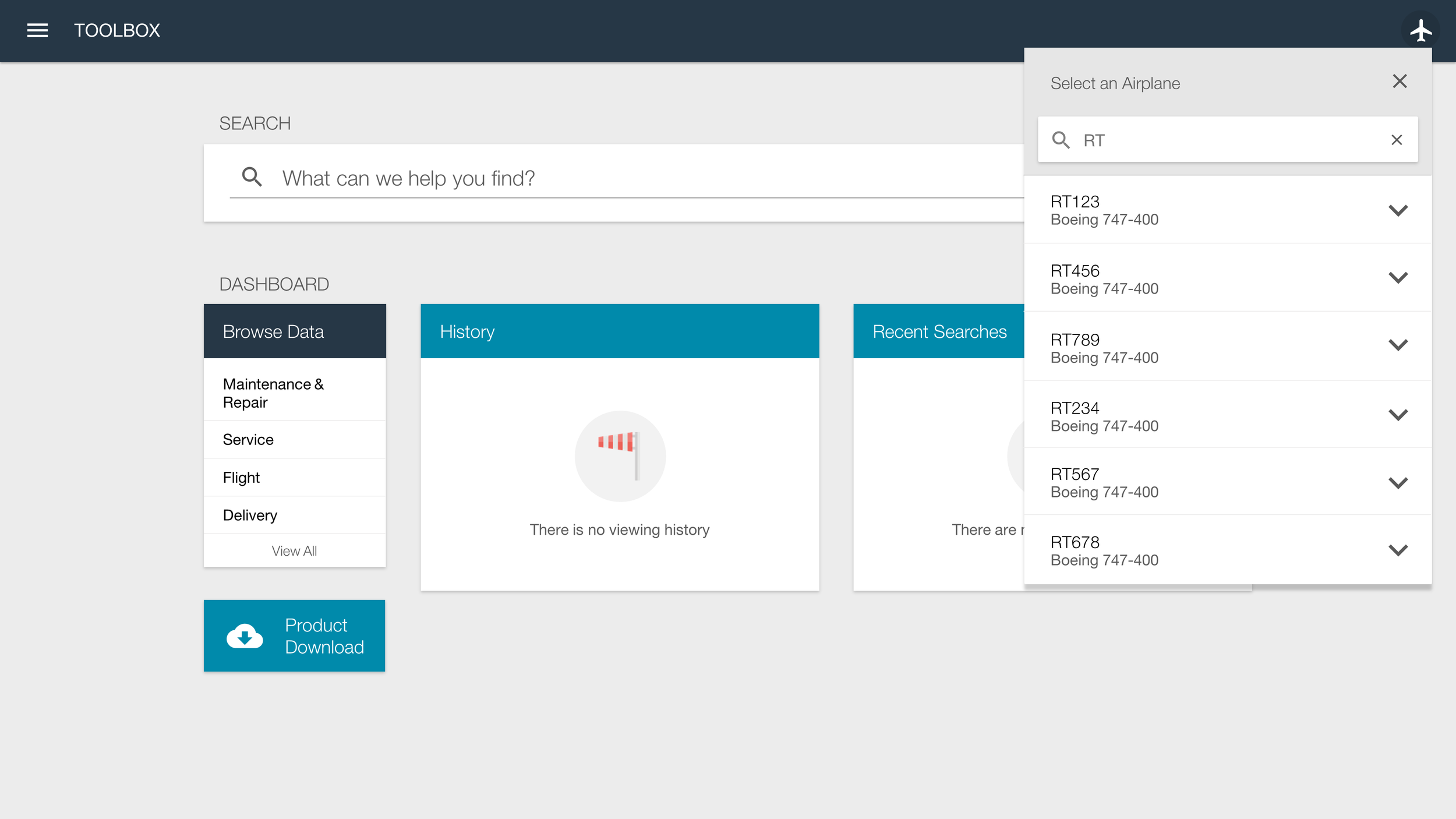
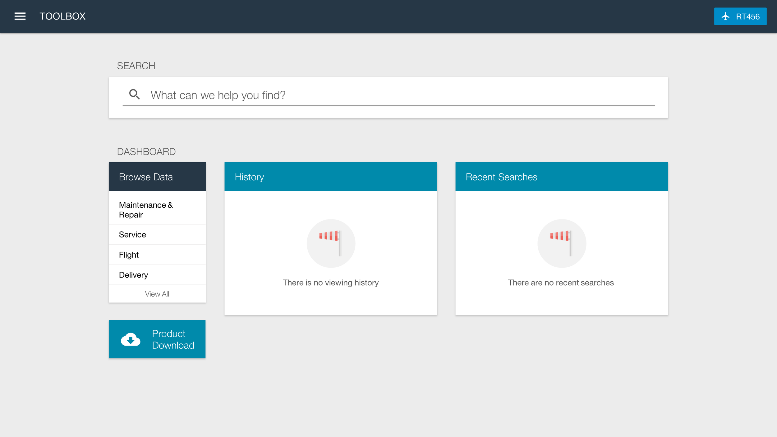
After the on-site workshop and before development began, I revisited the wireframes and feedback gathered during the Customer Advisory Board sessions to inform the first round of high-fidelity mockups. The goal was to translate the validated direction into a more complete design while preserving the decisions that had already been reviewed with users.
I presented these mockups during our monthly call, walking participants through the updated interaction and flow. Following our established feedback process, each participant shared structured input in the form of likes and dislikes, along with context. This feedback directly informed subsequent refinements before development.


Click through the initial high fidelity concept
Feedback from the Mockup Review
Likes
Simple, clean, intuitive design
Always available in the header
Very few steps to select airplane
Airplane list is searchable
Users can always see selected airplane
Dislikes
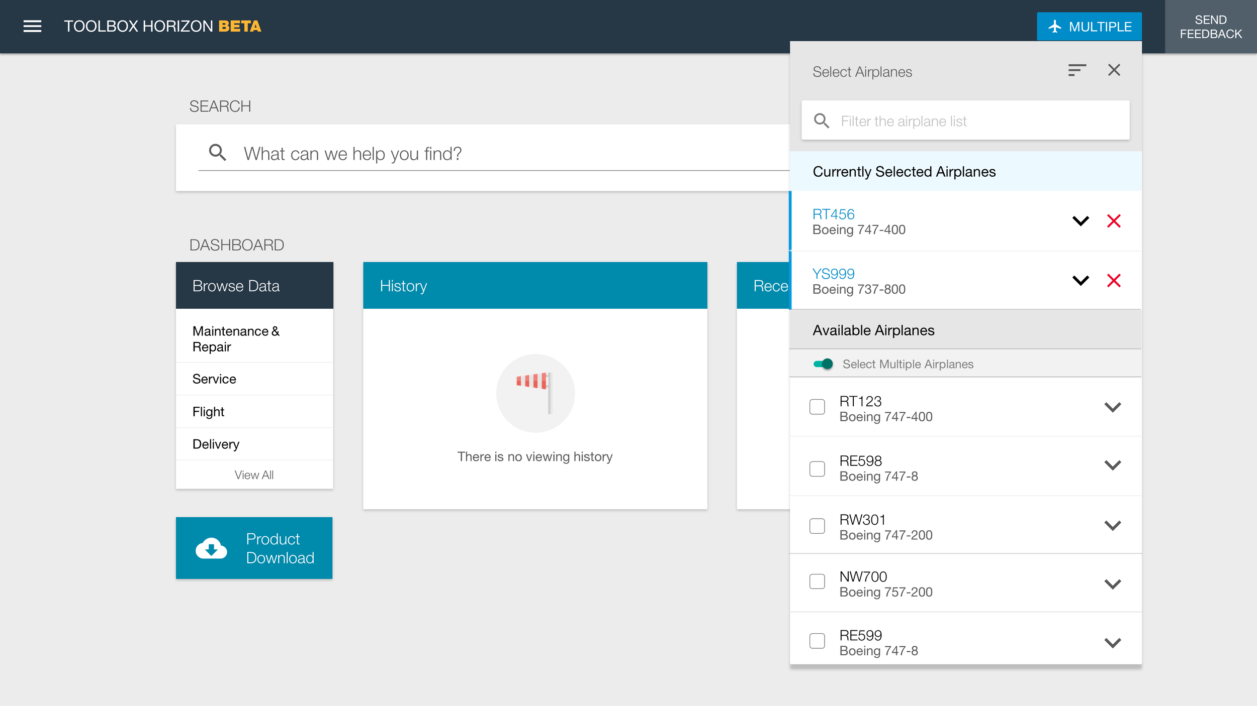
No support for selecting a range of airplanes
No ability to select multiple airplanes
No customization to change the airplane ID type
No ability to sort the list
Review
Before development began, I created a final iteration of the mockups that incorporated the majority of customer feedback, including support for multi-select airplanes, sorting, and updating airplane identifiers. The goal at this stage was to confirm that the design reflected what we had learned and resolved remaining points of friction.
I reviewed these final designs with customers during the next monthly Customer Advisory Board call, shared them through the project newsletter, and walked through them during on-site visits. Where appropriate, I converted the designs into clickable prototypes so users could experience the interaction flow directly. This final round of review helped ensure alignment and confidence before the design moved into implementation.


Click through the final design concepts
Talking with end users during an on-site research trip
Preparing user testing scenario with a prototype
Deliver
Once the designs were finalized, I prepared detailed redlines* (these were pre-Figma days). I also updated the online style guide, and partnered closely with the front-end development team to build a functional prototype. These materials were packaged and reviewed with the back-end engineering team during sprint planning to ensure shared understanding and smooth implementation.
From there, the solution was integrated into the production version of the product, completing the transition from user feedback to validated design to shipped functionality.
* I don't have the redlines for this mockup, another example provided.
Redlines from an iteration of the Browse Data design
We built an web style guide for developers
Results
Before the redesign, the Select an Airplane interaction received 0 % positive feedback, making it one of the lowest-rated features discussed during Customer Advisory Board sessions. After implementing the redesigned interaction using the process outlined in this case study, customer advisors reported 79 % positive feedback.
Beyond the metric itself, the shift reflected increased confidence in the system and reduced confusion around aircraft selection in a critical workflow. The redesign transformed a high-risk, low-trust interaction into one that users understood and supported. In fact, there was an across-the-board improvement to the scores, including Screen Real Estate and Browser Support also rebounding significantly from their 0% approval rating.
Pre-workshop survey results showing a 0% approval
Final survey results showing a 79% approval for the updated design