

ADHERENCE
reimagining Critical User data with good research
20M
Patients
90M +
Programs with Adherence
4k
Healthcare Orgs
360K
Providers
OVERVIEW
Program adherence data is critical for providers, administrators, and clinic leadership to understand patient progress and outcomes, and it also plays an important role in keeping patients informed and engaged in their own care. This work focused on designing adherence experiences across both web and native mobile apps, ensuring patients and providers had consistent, accessible insight wherever they engaged with care. Key metrics include exercise completion, pain and difficulty ratings, and reported barriers to adherence such as lack of time or equipment. In many cases, insurance reimbursement is tied to treatment outcomes, and research shows that stronger program adherence is closely associated with better results for both patients and providers.
The Problem
Prior to this project, MedBridge provided only basic adherence data, showing whether exercises were completed on a given day within a confusing seven-day sliding window. This limited view made it difficult for providers to see meaningful trends, intervene early, or connect adherence patterns to outcomes, despite research showing that patients with higher adherence are 2–3× more likely to achieve meaningful improvements. Patients also had very little visibility into their own progress over time.
At the same time, existing product architecture required that any new adherence insight be integrated into the Patient Profile without pushing critical program details further down the page, constraining how much value could be surfaced without adding cognitive or visual noise.
My Role
Owned end-to-end design across research, UX, interaction, and visual design.
Partnered closely with product management on product vision, scope, and strategy.
Delivered complete design assets to engineering, including flows, high-fidelity mockups, specs, and visual assets.
Collaborated during implementation to ensure quality, iterating and refining designs as constraints and insights emerged.
The Solution
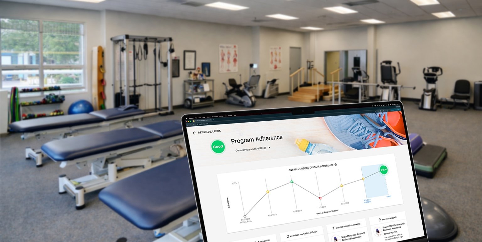
Through user research, I confirmed that adherence data was valuable not only to providers, but also to patients when presented with the right level of clarity and context. I designed an interactive adherence card and placed it directly below the patient’s core information, making progress visible without disrupting the overall layout.
The solution visualized adherence trends over time, allowing providers to quickly assess patterns while helping patients better understand their own progress. Users could tap into specific data points to explore program-level details, access a full-page view for deeper insight, and review skipped exercises, pain and difficulty ratings, frequency of attempts, and reported barriers. Additional context was available through a secondary drawer when needed.
The result was a clean, approachable experience that kept both providers and patients within three clicks of meaningful, day-to-day adherence insight. Much of this data had not been visible prior to the redesign, significantly improving shared understanding and enabling more informed, timely action.
“Aryk’s design process is both collaborative and efficient. He balances creativity with practicality, ensuring that his work not only looks great but also addresses real user needs and business objectives.”
Before & After
At first glance, this project may look like a traditional redesign, but it was more of a reimagining of how adherence data could support both providers and patients. Prior to this work, the Adherence Dashboard felt like an afterthought - limited in data, weak in structure, and disconnected from how progress is actually understood or acted on.
The updated design reframed adherence as a core part of the patient experience, making progress and challenges visible at a glance while significantly improving clarity, usability, and visual cohesion across the page.
Before: Very little data, even less design
After: Robust data with a thoughtful design
Research
Research for this project presented unique challenges. Due to HIPAA protections, direct access to patients was limited to a small group of 8 MedBridge employees who were actively receiving care. Access to providers was broader, and I interviewed 11 participants ranging from small physical therapy clinics to large institutions such as the Mayo Clinic.
I conducted competitive analyses and found that adherence reporting across MedBridge’s competitors was often limited or entirely absent. To ground the work in real-world needs, I led interviews with providers, administrators, and patients. Early conversations focused on how adherence was currently tracked and acted upon, with follow-up sessions used to review mockups, prototypes, and the working product.
This research was framed by a broader industry challenge: adherence to home exercise programs in physical therapy is often low, with only about 35% of patients fully following their prescribed plans, highlighting a significant opportunity to improve outcomes through better adherence support.
A key insight from the research was that high-level adherence trends alone were not enough. Providers needed context to understand why patients were struggling, which led to the inclusion of mechanisms for patients to report barriers and enabled more informed, responsive care.
Refined Sketches and Notes from the Research Phase
Solution
Through user research, I confirmed that adherence information was valuable not only to providers, but also to patients when presented with the right level of clarity and context. The solution visualized adherence over time, allowing providers to quickly assess trends while helping patients better understand their own progress. Users could explore program-level details by selecting data points, access a full-page view for deeper insight, and review skipped exercises, pain and difficulty ratings, frequency of attempts, and reported barriers. Additional context was available through a secondary drawer when needed.
The result was a clean, approachable experience that kept both providers and patients within three clicks of meaningful, day-to-day adherence insight. Much of this data had not been visible prior to the redesign, significantly improving shared understanding and supporting more informed, timely action.
Updated Patient View
Updated Provider View
Selected Patient and Provider Mobile Views
Impact
While I’m not able to share specific results from multiple rounds of usability testing, this work scaled across MedBridge’s web and native mobile platforms, supporting adherence tracking for a large and diverse healthcare audience. MedBridge reports that its platform is used by 360,000+ providers across 4,000+ organizations, with more than 20 million patients completing over 90 million prescribed programs. The adherence experiences designed in this project shape how progress and outcomes are understood at scale across that ecosystem.